
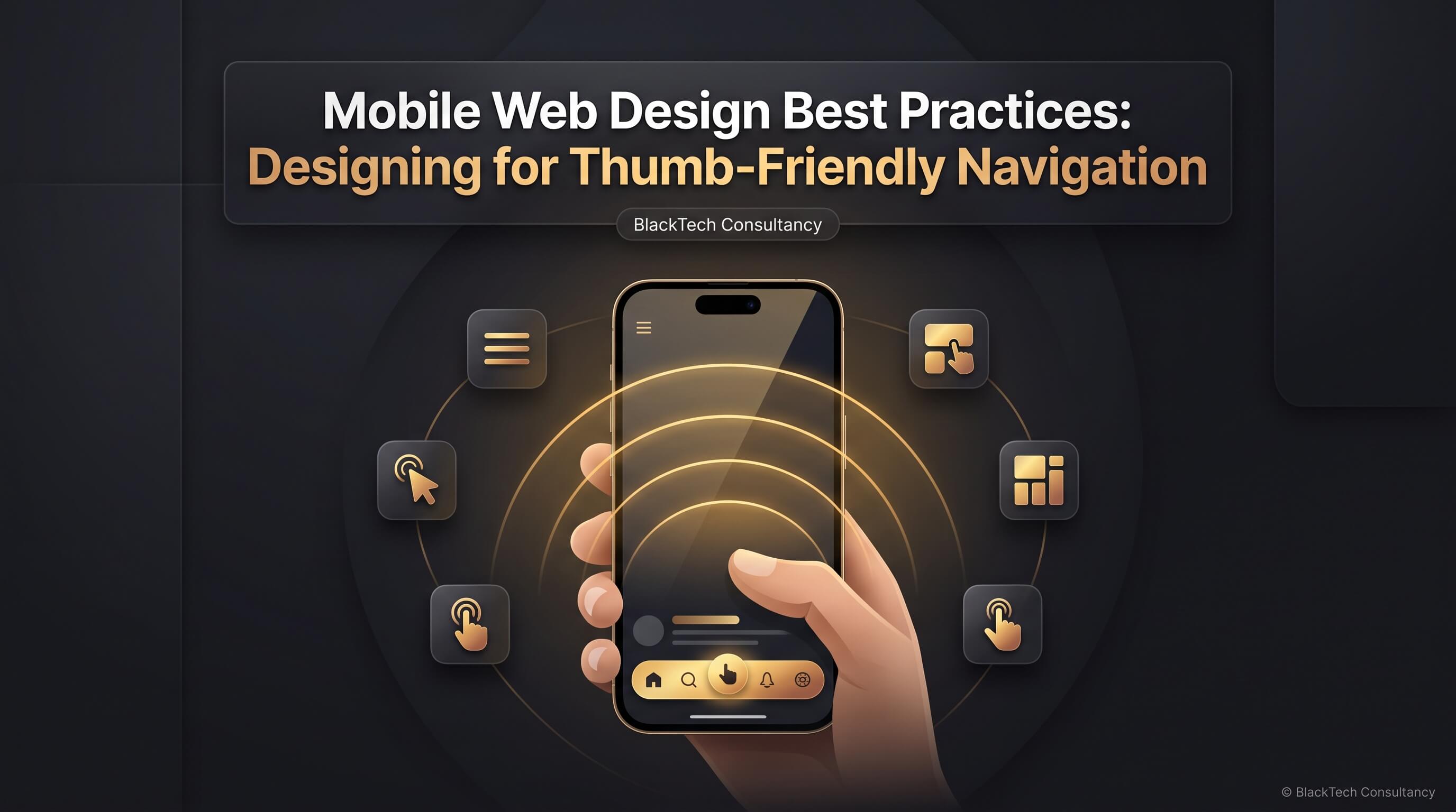
Every website visit today starts with a thumb hovering over a glowing screen, ready to tap, swipe, or scroll toward whatever the visitor needs. That single observation explains why mobile web design has moved from a secondary consideration to the primary battlefield for user experience, conversions, and search visibility. A website that looks flawless on a desktop monitor can still frustrate a visitor holding a phone with one hand on a crowded train, and that frustration usually ends in a lost customer. This article breaks down the practical, research-backed methods professional designers use to build thumb-friendly navigation, why it matters for mobile UX design, and how to apply these principles to your own site without guesswork.
Mobile Web Design in a Screen-First World
Mobile web design refers to the practice of building websites that function smoothly, load quickly, and feel natural on smartphones and tablets. It goes far beyond simply shrinking a desktop layout to fit a smaller screen. A genuinely mobile-friendly web design accounts for how people physically hold their devices, how far their thumbs can comfortably reach, how bright or dim the lighting might be when they browse, and how much patience they have before abandoning a page that feels clunky.
The shift toward mobile browsing has been gradual but relentless. Search engines now index the mobile version of a site first, advertisers judge landing pages by mobile load speed, and shoppers routinely complete entire purchase journeys without ever touching a laptop. Because of this, mobile website usability has become a measurable business metric rather than a design preference. A site that scores well on desktop but performs poorly on a phone will lose both rankings and revenue, regardless of how polished the underlying content might be.
Designing for mobile also means designing for constraint. Screen real estate is limited, attention spans are shorter, and interaction happens through fingers rather than a precise mouse pointer. Every design decision, from font size to button placement, needs to respect these constraints while still delivering a complete and satisfying experience. That balance between simplicity and completeness sits at the heart of good mobile web design.
Why Thumb-Friendly Navigation Matters for Mobile UX Design
Thumb-friendly navigation is the practice of placing interactive elements, such as menus, buttons, and links, within the natural reach of a user's thumb rather than forcing awkward stretches or a second hand to operate the phone. Research into how people actually hold their devices shows that a large majority of smartphone interactions happen with one hand, and the thumb does almost all of the work. When navigation elements sit outside that comfortable arc, users either strain to reach them or abandon the task altogether.
This matters because navigation is the skeleton of any website. If visitors cannot find the menu, locate the search bar, or tap a call-to-action without fumbling, the rest of the design becomes irrelevant. Mobile navigation best practices exist precisely because poor navigation is one of the most common reasons visitors leave a site within seconds of arriving. A thumb-friendly layout reduces friction at the exact moment a visitor decides whether to stay or leave.
There is also a psychological dimension to this. When an interface responds exactly where a user expects it to, the experience feels effortless, almost invisible. That invisibility is the goal of good mobile UX design: the technology should fade into the background so the content and the task take center stage. Thumb-friendly navigation is one of the clearest ways to achieve that seamless feeling.
Mapping the Thumb Zone: The Science Behind Reachability
Designers often refer to the "thumb zone" when planning mobile layouts. This concept divides the screen into three general areas based on how easily a thumb can reach them while a phone is held in one hand: a natural zone that requires no stretching, a stretch zone that demands some effort, and a hard-to-reach zone that usually requires a second hand or a shift in grip. Understanding this map is the foundation of how to design thumb-friendly navigation that actually works in real-world conditions.
The lower half of the screen, particularly the bottom center and bottom corners, tends to fall within the natural zone for most right-handed and left-handed users alike. The upper corners of the screen, especially the far edges, are the hardest areas to reach comfortably. This is why so many modern apps and mobile-optimized websites have moved primary navigation away from the top of the screen and toward the bottom, a shift that stands in direct contrast to older desktop-first conventions where menus traditionally lived at the top.
| Screen Zone | Reachability | Best Use for Navigation |
|---|---|---|
| Bottom center and lower third | Natural, effortless reach | Primary navigation bar, main call-to-action buttons |
| Middle of screen | Comfortable with slight stretch | Secondary content links, form fields |
| Top corners and upper edges | Difficult, often requires two hands | Low-frequency actions, back buttons, branding |
This mapping does not mean the top of the screen should be abandoned entirely. Branding, status indicators, and infrequently used settings can still live there, since users do not need to reach them constantly. The goal is to reserve the easiest zones for the actions people perform most often, which is a core idea behind thumb-friendly mobile website design.
Core Principles of Mobile Navigation Design
Good mobile navigation design rests on a handful of consistent principles that apply regardless of industry or content type. The first is clarity. Visitors should understand what each navigation element does within a fraction of a second, without needing to tap it just to find out. Ambiguous icons, vague labels, or hidden menus that reveal unexpected content all work against this principle.
The second principle is consistency. Navigation elements should behave the same way across every page of the site. If a bottom bar controls the main sections on the homepage, it should continue to do so on product pages, blog posts, and contact forms. Inconsistent navigation forces users to relearn the interface repeatedly, which increases cognitive load and reduces trust in the site.
The third principle is minimalism, though not at the expense of function. A cluttered menu with too many options overwhelms a small screen and makes decision-making harder. Effective mobile website navigation trims choices down to the essentials, then uses secondary menus or search functionality to handle the long tail of less common needs.
Finally, feedback matters. When a user taps a button, something should visibly change, whether through a color shift, a subtle animation, or a page transition. This confirms the action registered and prevents the frustrating experience of tapping something twice because there was no visual confirmation the first time.
How to Design Thumb-Friendly Navigation: Practical Techniques
Turning the thumb zone concept into an actual design requires several concrete techniques. Placing the primary navigation bar at the bottom of the screen is one of the most effective changes a site can make, since it puts the most important actions directly under the user's natural grip. Many leading mobile apps have already normalized this pattern, so visitors arrive with an existing mental model of how a bottom bar should behave.
Floating action buttons offer another practical solution. A single, prominent button anchored near the bottom corner of the screen can house the most important action on a page, such as adding an item to a cart or starting a contact form, without competing for space with the rest of the layout. Because it sits within easy reach, it tends to receive far more engagement than a similarly important link buried in a top navigation bar.
Collapsible menus, often triggered by a hamburger icon, remain useful for housing secondary navigation, but they should never hide primary actions that users need frequently. A well-designed site treats the hamburger menu as a supplement to visible navigation rather than a replacement for it. Hiding everything behind one icon can technically save space, but it also hides opportunities, since users are far less likely to explore a menu they cannot see.
Sticky navigation bars, which remain visible as a user scrolls, also support thumb-friendly interaction by keeping key actions accessible no matter how far down the page someone has traveled. This is particularly valuable for long-form content, product listings, or blog articles where scrolling distance can otherwise separate a reader from the navigation entirely.
Touchscreen Navigation: Sizing, Spacing, and Tap Accuracy
Touchscreen navigation depends heavily on precise sizing. A finger is far less accurate than a mouse cursor, and average adult fingertip contact areas are considerably larger than the small arrow icon most people picture when they think about clicking. Because of this, tap targets that work perfectly on desktop often fail on mobile simply because they are too small or placed too close together.
Widely accepted accessibility guidelines recommend a minimum tap target size of roughly 44 by 44 pixels, with comfortable spacing between adjacent elements to prevent accidental taps on the wrong button. This becomes especially important in navigation menus, where multiple links often sit stacked closely together. A menu that looks fine visually can still frustrate users if the spacing forces repeated mis-taps.
Beyond raw size, the shape and padding around a tap target also influence accuracy. Buttons with generous internal padding feel more forgiving to tap than text links with no surrounding space, even if the visible text itself is the same size. Designers should treat the entire clickable area, not just the visible label, as part of the design decision.
| Element | Recommended Minimum Size | Spacing Guidance |
|---|---|---|
| Primary buttons | 44px x 44px | At least 8px between buttons |
| Menu list items | 48px height | Full-width tap area, no overlapping links |
| Icon-only controls | 44px x 44px | Extra padding since icons lack text labels for context |
Comparing Popular Mobile Navigation Patterns
Several established navigation patterns have emerged from years of mobile design experimentation, and each comes with distinct trade-offs. Choosing the right one depends on the type of site, the number of sections that need representation, and how often users need to switch between them.
| Navigation Pattern | Best For | Limitations |
|---|---|---|
| Bottom tab bar | Sites with three to five core sections needing constant access | Becomes cramped beyond five items |
| Hamburger menu | Content-heavy sites with many secondary pages | Hides options from view, lowering discoverability |
| Sticky top bar with search | E-commerce and content platforms with strong search intent | Top position is harder to reach one-handed |
| Floating action button | Highlighting a single critical action | Not suitable as the only navigation method |
| Tab-based sub-navigation | Switching between related categories on one page | Can feel cramped on very narrow screens |
Many well-designed sites combine several of these patterns rather than relying on just one. A bottom tab bar might handle the four most important sections of a site, while a hamburger menu tucked into a corner covers less frequent needs like account settings or legal pages. This layered approach reflects mature mobile navigation best practices for UX, since it balances accessibility with the reality that not every function deserves equal prominence.
Responsive Web Design and Its Connection to Thumb-Friendly Navigation
Responsive web design is the technical foundation that makes thumb-friendly navigation possible across the enormous range of device sizes in use today. Rather than building separate sites for phones, tablets, and desktops, responsive design uses flexible grids, scalable images, and media queries so that a single codebase adapts intelligently to whatever screen it appears on.
A responsive layout does more than resize elements proportionally. It should also reorganize navigation entirely when the screen shrinks, moving a horizontal top menu into a bottom bar or collapsible drawer once the viewport falls below a certain width. This kind of adaptive restructuring, rather than simple scaling, is what separates genuinely mobile-friendly navigation from a desktop site that has merely been compressed.
Breakpoints, the specific screen widths where a layout shifts to a new arrangement, need careful planning based on real device usage data rather than arbitrary numbers. Testing across common phone and tablet dimensions helps ensure that navigation elements never end up awkwardly positioned in the gap between two breakpoints, a common flaw that undermines otherwise solid responsive navigation design.
Improving Mobile Website Usability Beyond Navigation
While navigation sits at the center of this discussion, mobile website usability depends on several supporting factors that reinforce or undermine thumb-friendly design. Page load speed is one of the most influential. Even the most carefully designed navigation menu becomes irrelevant if the page behind it takes too long to appear, since impatient users often leave before the layout even finishes rendering.
Font legibility plays a similar supporting role. Body text that is too small forces users to zoom in, which disrupts the careful thumb-zone layout designers worked to establish, since zoomed content shifts navigation elements out of their intended positions. Maintaining readable font sizes without requiring zoom keeps the entire interface, including navigation, functioning as designed.
Form design also deserves attention, since many navigation paths eventually lead to a form, whether for checkout, contact, or account creation. Input fields sized for finger taps, appropriate keyboard types triggered automatically for email or phone fields, and minimal required fields all reduce the friction that can undo the benefits of otherwise excellent navigation design.
Common Mobile Navigation Mistakes That Undermine UX
Several recurring mistakes show up across otherwise well-intentioned mobile websites. Overloading the top of the screen with logos, search bars, and multiple menu icons crowds the hardest-to-reach zone with the most frequently needed controls, working directly against thumb-friendly principles. Designers sometimes default to familiar desktop layouts without reconsidering how those choices translate to a handheld device.
Another common error is nesting navigation too many levels deep. When a user has to tap through three or four submenus just to reach a basic page, the experience feels exhausting rather than efficient. Flattening the hierarchy, even if it means slightly longer menus, usually produces a smoother path to the content visitors actually want.
Inconsistent iconography also causes confusion. Using a shopping bag icon for the cart on one page and a different icon on another breaks the mental map users build as they navigate the site. Sticking to widely recognized icon conventions, paired with text labels where space allows, prevents this kind of avoidable friction.
Finally, ignoring real device testing in favor of browser-based simulators alone often misses subtle problems. Simulators cannot fully replicate the feel of tapping with an actual thumb, the glare of outdoor sunlight, or the awkward grip someone uses while standing on a train. Testing on physical devices remains an essential step in catching these gaps.
Testing and Optimizing Mobile Navigation for Better User Experience
Optimizing navigation for mobile devices is not a one-time task completed during the initial design phase. It requires ongoing observation of how real visitors interact with the site. Heatmap tools that track where users tap, scroll, and pause provide direct evidence of whether navigation elements sit where people naturally expect them.
Session recordings offer another valuable layer of insight, revealing moments of hesitation, repeated taps on unresponsive elements, or accidental navigation away from an intended page. These small friction points rarely show up in a quick visual review but become obvious once real usage data is reviewed carefully.
A/B testing different navigation placements, such as comparing a bottom tab bar against a traditional top menu, can quantify the actual impact of thumb-friendly design choices on metrics like time on site, bounce rate, and conversion rate. This turns design intuition into measurable business results, which strengthens the case for continued investment in mobile UX improvements.
Accessibility testing rounds out a thorough optimization process. Navigation should remain usable for people relying on screen readers, voice control, or switch devices, not just for users with typical finger dexterity. Building accessible navigation from the start tends to produce a cleaner, more forgiving interface for every visitor, not only those with specific accessibility needs.
A Practical Checklist for Mobile-Friendly Navigation
- Place the primary navigation within the natural thumb zone at the bottom third of the screen.
- Keep tap targets at least 44 by 44 pixels with generous spacing between them.
- Limit the main navigation to three to five essential sections.
- Use a sticky or persistent navigation bar for long-scrolling pages.
- Ensure every icon has a clear, recognizable meaning or a supporting text label.
- Avoid nesting menus more than two levels deep.
- Test navigation on real devices under real lighting and grip conditions.
- Review heatmaps and session recordings regularly to refine placement.
- Confirm that navigation adapts properly at every major screen breakpoint.
- Provide visible feedback, such as color change or animation, for every tap.
Schedule An Appointment with BlackTech Consultancy
Building a mobile web design that truly serves thumb-friendly navigation takes more than following a checklist; it requires ongoing design judgment, testing, and refinement tailored to your specific audience. If your website could benefit from a professional review of its mobile navigation, layout, and overall usability, the team at BlackTech Consultancy is ready to help you plan the next step.
BlackTech Consultancy
Virginia, United States
+1 571-478-2431
info@blacktechcorp.com
https://www.blacktechcorp.com/
Frequently Asked Questions
What makes mobile web design different from designing for desktop?
Mobile web design accounts for smaller screens, finger-based interaction instead of a mouse, and one-handed usage patterns that desktop design does not need to consider. It also demands faster load times and simplified navigation, since mobile users typically browse in shorter, more distracted sessions than desktop users.
How do I know if my navigation is thumb-friendly?
Test the site by holding a phone naturally in one hand and attempting to complete common tasks using only your thumb. If you find yourself stretching, shifting your grip, or reaching for a second hand to tap primary navigation elements, the layout likely needs adjustment to better fit the natural thumb zone.
Should every mobile site use a bottom navigation bar?
Not necessarily. A bottom tab bar works best for sites with a small number of core sections that users need constantly. Content-heavy sites with many secondary pages often pair a simplified top bar with a hamburger menu instead, since forcing every option into a bottom bar can quickly overcrowd the interface.
How often should mobile navigation be tested and updated?
Mobile navigation benefits from review at least every few months, or whenever analytics show a rise in bounce rate or a drop in engagement on mobile devices. New device sizes and evolving user habits mean that navigation which felt optimal a year ago may need refinement to stay aligned with current mobile UX design standards.
Does thumb-friendly navigation affect search engine rankings?
Indirectly, yes. Search engines factor mobile usability signals, including navigation clarity and ease of use, into how they evaluate a site's overall experience. A site with confusing or hard-to-reach navigation tends to show weaker engagement metrics, which can influence rankings even though navigation itself is not a direct ranking factor.